The Challenge
The report showed network interruptions, outages and trends as static screenshots. You could look at the data. You could not do anything with it.
0
Loading

hi@salemtello.studio
Google's internal WAN Availability Report was a stack of screenshots. I rebuilt it as a dashboard you can filter, sort and drill into, using Google's own PLX library
UX Researcher
& Designer
3 Months
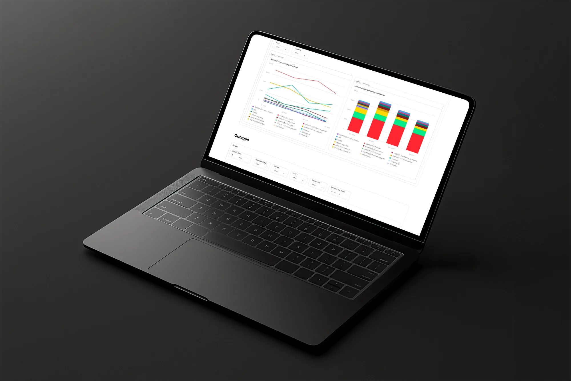
I signed an NDA with Google, so there is not much I can show. The numbers in this image are fake.
The report showed network interruptions, outages and trends as static screenshots. You could look at the data. You could not do anything with it.
Executives and network engineers in several departments. They read this report to decide where to invest and to know how bad an outage is while it is happening.
One dashboard, built in Google's PLX library, that holds the five report categories on a single screen. It added 16 features the old report never had: filters, drill-down, sharing, and picking the exact slice of data you need.
To answer one question about network availability, an engineer had to walk through a sequence of screenshots and read the numbers off the images. No filtering, no drilling down, no comparing two points. People rebuilt the data by hand in spreadsheets, and a routine check ate a chunk of the morning.
I had never worked on network infrastructure before, so I spent the first phase reading, asking and learning PLX, the library that would end up deciding what I was allowed to design.
I learned how Google's internal WAN works, so I could see everything the report had to cover.
Network architecture, availability metrics, bad minutes, and which team reads which number.
I mapped the route people walked through the old report, and where they got stuck.
I audited the 5 report categories and how each one shows its data, then marked every spot where screenshots let people down.
I learned PLX, the internal library the developers would build this with. This part took the longest.
Knowing what PLX can and cannot do told me which features were real and which ones I had to drop. It has no responsive support, for example.
I ran the research across departments, because each one wanted a different thing from the same report.
I interviewed executives and engineers until the list of requirements stopped growing.
I sat with developers and engineers to learn how the WAN works and where the report lands in their week.
I walked the whole journey through the static report and wrote down every friction point and every workaround people had invented.
I ran simulations with test data in PLX to see what it could draw, what it could filter, and where it broke.
I interviewed people from the other departments too. Each one uses this report for something different, and I did not want to miss a requirement.
The users were too different from each other to treat the feedback as one pile, so I sorted it into the report's five categories. I wrote down every point people raised, including the ones I could not build because PLX would not do it or because the team had decided otherwise.
Feedback and complaints collected on earlier versions of the report
How teams were reading the static report, and the workarounds they built for themselves
My own interviews with executives and engineers from several departments
Bad minutes get logged every 10 seconds, so the data never sits still
Alerts for bad-minutes with prioritization and time-range evolution
Drop the 28-day limit and let people pick a wider window
Quarterly and weekly trend comparison views
A network agnostic view, to analyse without picking a network first
General pair availability (independent from B2/B4)
Individual event duration tracking for bad minutes
Drill down to specific region-pairs, B2 sector/B4 neighborhood, metroshard and topology domains vs. aggregate level
I wrote a manual explaining how to reach every point people had asked for, and why the rest could not happen, either because PLX would not do it or because the team had decided otherwise. The developers built from that document, so nothing got lost on the way from research to code.
I designed the interface while I was still learning PLX, so every feature got checked against what the library could draw before it went in.
The screenshots are gone. Network data now lives in a structure you can open, explore and reshape, in a fraction of the space.
The five categories and their subcategories share one screen. You no longer page through static content hunting for one number.
16 features the old report never had. You can filter, drill down, share a view, and ask for the exact slice of data you came for.
I checked every decision against PLX before committing to it. Its limits, no responsive support among them, drew the edges of what this could become.
First mockups, built from the requirements and already boxed in by what PLX allows
I tested each element in PLX to see if it could exist at all
Test charts, to check how the data rendered, filtered and responded to a click
I reworked the designs with what the tests taught me and what the team asked for
PLX does not do responsive design. The dashboard had to live in a fixed desktop viewport, and that single limit decided most of the layout and every interaction on it.
Learning PLX took a big slice of the project. Once I knew where its walls were, I could push it to the edge and still warn the team early about what the final product would never do.
Same data, 14% of the space it used to take, plus 16 things you can now do with it
The old report let you look at the data and never touch it. No filters, no drill-down, no comparing two points. If you needed more, you rebuilt it by hand in a spreadsheet. The redesign folds the five categories into one screen you can question, and it stays inside what PLX can deliver. Same data, finally usable.
Five report categories on one screen, in 14% of the space the old report needed. The 16 new features are what got it there: filter, drill down, share, and ask for the exact data you came for.